If you’ve built a lot of dashboards in ActionKit, you know that dashboards allow you to display information from one or more reports and format it any way you like.
ActionKit comes standard with many useful built-in dashboards, and you may notice that some of them display interactive charts, graphs, and even maps.
If you’d like to be able to make charts, graphs, and maps out of your data, it’s easier than you might think!
First, let’s take a look at how the built-in “Action Rates: Your Monthly Progress Report” dashboard creates its chart:
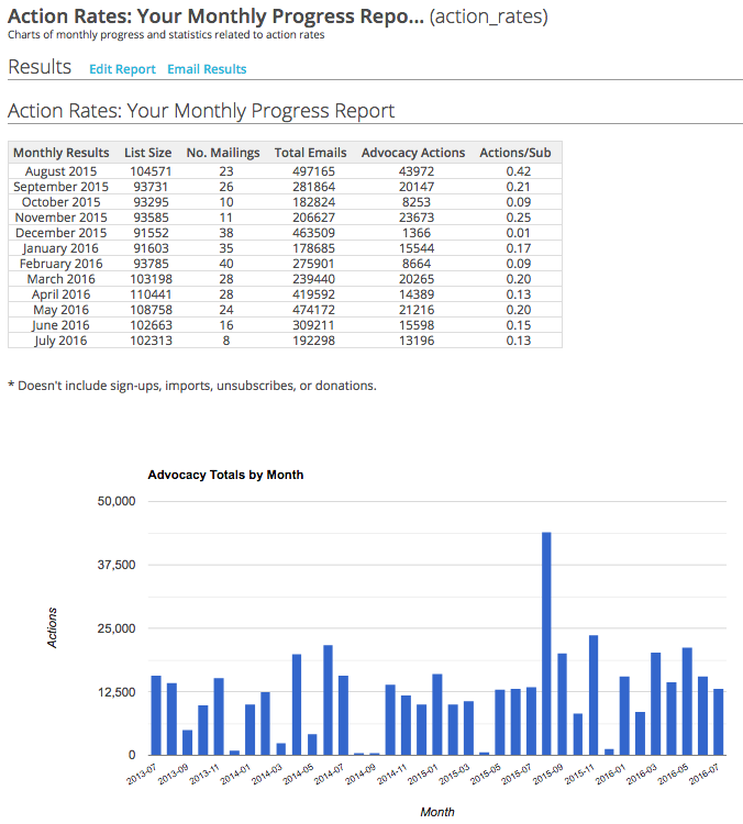
From your Reports tab, search for “Action Rates: Your Monthly Progress Report” and edit it. First thing you’ll see is some Javascript setting the title and axis titles for the chart, but strictly speaking, they’re not necessary.
The code that displays the results of the report is {{ reports.progress_actions_chart }}, and wrapping that in a div with the special classes google-chart and ColumnChart transforms it into the chart we see:
<div id="actionsByMonthChart" class="google-chart ColumnChart" style="height: 500px">
{{ reports.progress_actions_chart }}
</div>
You’re not limited to ColumnCharts, either – you can use many of the charts in the Google Chart gallery just by changing the div’s class to any of the following: AreaChart, BarChart, ColumnChart, GeoChart, LineChart, PieChart, and Table.
For example, by changing the ‘ColumnChart’ class to ‘LineChart’ in the above code snippet, we get a different chart type in our dashboard:
<div id="actionsByMonthChart" class="google-chart LineChart" style="height: 500px">
{{ reports.progress_actions_chart }}
</div>
So your chart would look something like this:

So next time you’re creating a dashboard, try displaying your results as a chart instead!
Interested in scheduling a demo with ActionKit? Let us know!